I was just curious about Creators in general… do you have your own face on your watch or someone else’s?
What is your favorite watchface?
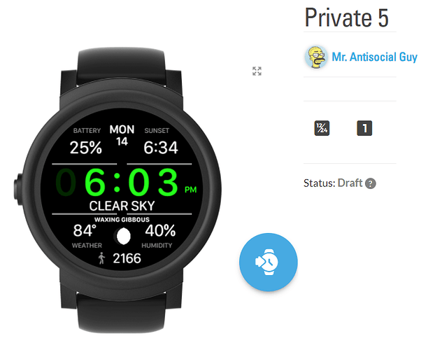
I usually wear my own. Currently I’m wearing a watch face I’m working on, but my favorite is my own Hijo.de.la.Luna:
I usually test my new, unreleased ones.
Most of the time, if you look at someones profile, it will tell you what Face they are currently using 
I am using my own Face, purely because I designed it to how I like it, showing only the info that I want to see, and oh…I love it of course 
P.S. @ThaMattie I like that Face mate 
I tend to use my simplest ones, and the ones I have found to be most battery efficient.
Currently the go to is:
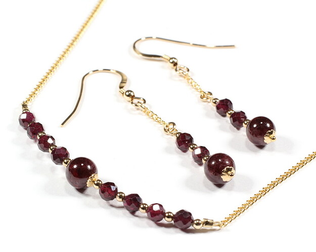
I haven’t published any of my 50+ faces (yet), but I usually wear the current face I’m working on for an extended “test drive” so to say, which at the moment is my gemstone-themed birthstone face (January/Garnet in this case, and below it my inspiration, the actual Garnet necklace/earrings birthstone set, also my own creation, that I sell at Etsy craft events)
My most favorite, on the other hand, is my own recreation of a colorful 1970’s watch from the Soviet air force.
That is a pretty one! Nice! 
About 15% of the time I wear a test face to see how things are working on whatever is the creation of the week. My current go to face that I’m wearing most of the time is Steel Drum, as it has most of the data I need, is easy to read, and has a subbtle yet cool animation.
Althougth I often wear one of my Earthshade faces too, as I enjoy that subbtle, yet cool animation too. 
That is nifty… problem is I keep watching it… LOL
I can see why you like this. It is catchy. But the design has great info and deceptively simple. I would use that, too!
I do like your understated animations. They make me think the work you put in is exacting, but at the same time, easy on the eyes.You pack a lot into a small space!
This one is definitely in the elegant category! 
Right now, I’m wearing one of my unpublished faces. It’s made like the Samsung Dashboard face only the way I want it to be that can’t be done by Samsung’s Wear app customization.
Very Nice. A decent amount of info but still clear, concise and readable.
I almost always have a B Sharp work in progress on. At this point I have quite a few at various stages of development, which means also various stages of testing.
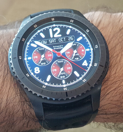
I use watchface I made long ago with Galaxy watch designer for a friend.
Layout is similar to the one below, but has changeable colours of digits, subdials and background, shorcuts to apps, sunburst effects rotating with wrist movement.
It cant show day-/night-time nor the phone battery.
I cant use facer ap on my watch for long, it makes my watch battery to deplete in less than a day.

It is very nice, but too much infor for me for a go-to face, But only by a little bit, I do like it.
It’s a preference thing but I am all fot minimal on my initial face, tap for a wee bit more and slide for extra. Get it when you want it.
Thank you for asking. I wear this I have been working on it for months it was what II wanted when I got my Watch. It has more Data when you lift your wrist. This is the unpublished version as it has solstice markers that will only apply to the 50 th parallel. I often wear Matties Hijo for a Change. Must have the Moon on the Face as I am a bit of a Lunatic.
Usually one of my own. That’s who I make them for. 
I like it! Easy to read and the time stands out very well!

