a note on current occasion…
Actually, that should be clear if you stick to the rules, but I still have to write it apparently.
All images shown here are for display only.
These images may not be copied or altered.
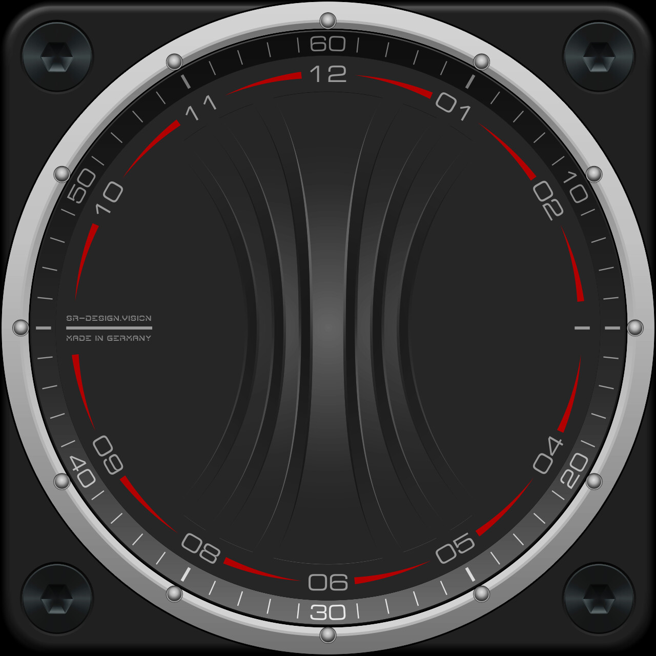
I started with the outer ring.
I just didn’t have an idea for the dial.
So I just started playing with different graphic ideas.
There is also a form that I tested and rejected in the last face.
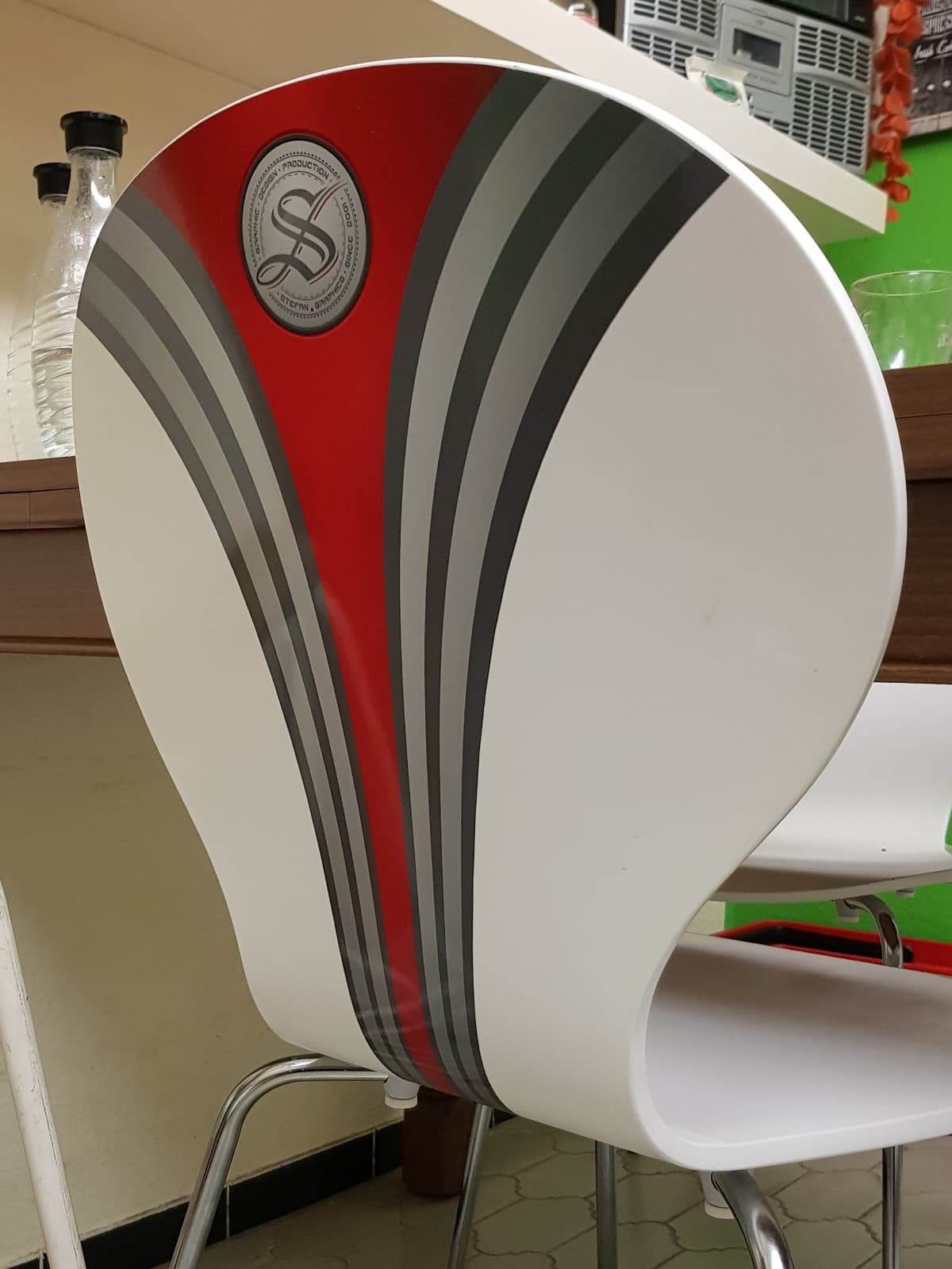
The shape has fascinated me for a long time.
I also wrapped my kitchen chairs like this.
now back to the topic …
was you think?
I’m open to any kind of opinion, criticism and ideas.
8 Likes
I like where you are headed, but I would save the top image just below your chair picture for an AOD version of whatever you come up with. It looks nice enough to be a main face by itself if you ever decide to do a dark theme version.
2 Likes
Just use bigger fonts this time… 
2 Likes
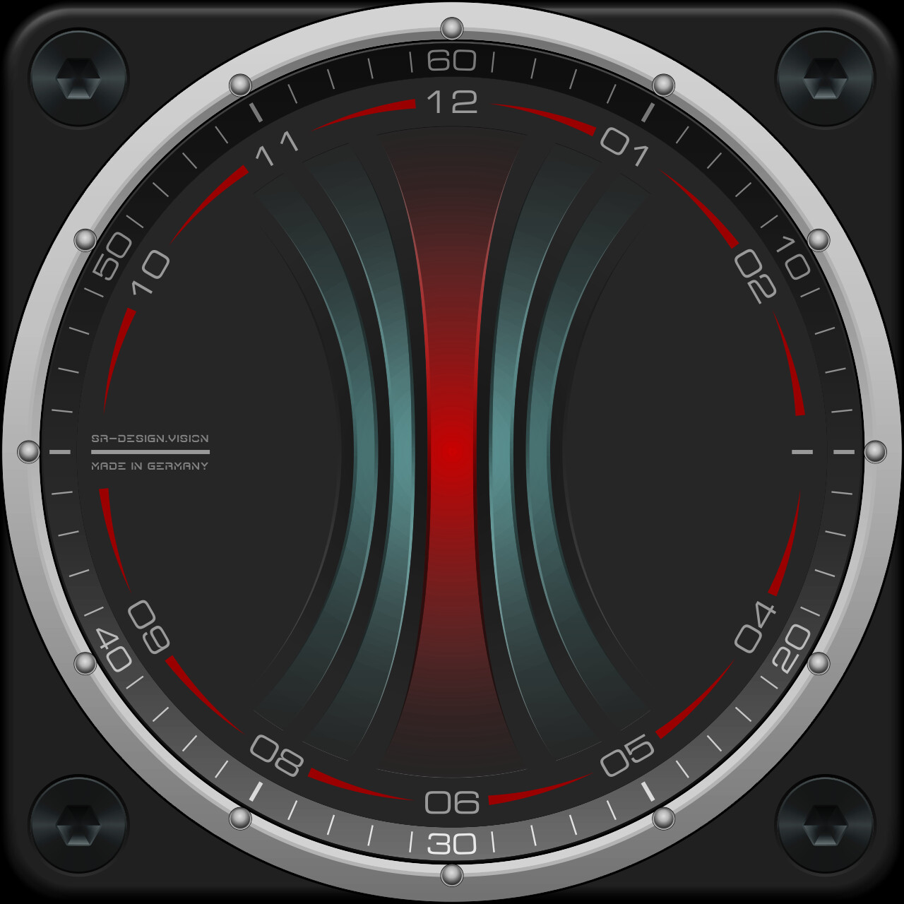
The top WIP is nice. Center Bar red as per seat.
1 Like
Looking great my friend, the White is too bright for me, not sure about having 2 sets of Numbers there either sorry 
2 Likes
I admit that the numbers on an analogue watch are just decoration for me.
If someone relies on being able to read these numbers, they should use a digital watch. 
I tend to prefer the first two versions.
The light variant was a test to get closer to the martini look.
1 Like
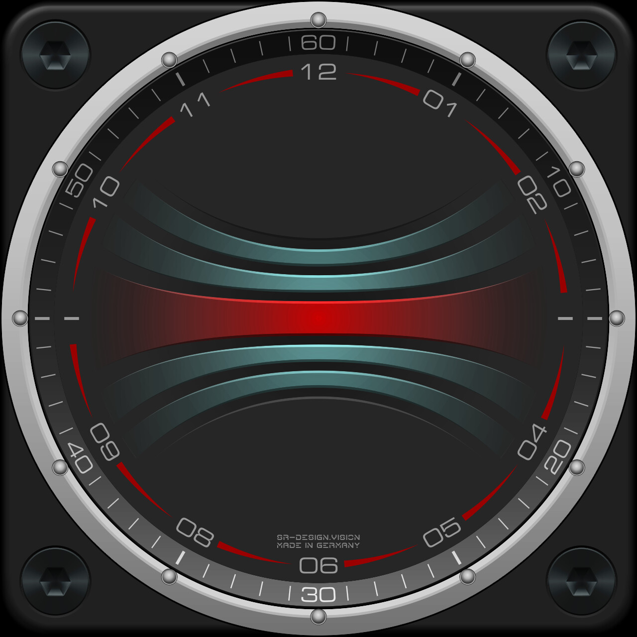
put the whole thing sideways…
it would probably be more practical for additional information.
but do i really like it?
Should I make the vertical version as a classic analog one?
… and build the horizontal one as a hybrid?
Apparently a lot of people like hybrid faces with a lot of information.
3 Likes
Don’t know about you but I DO like it horizontally. Hopping for digital version.
2 Likes
Amazing how the background calls the shots. I was working on a Bow Tie Hybrid. Might change my mind or cordinate my publication with you :::)))
1 Like
SR-Design.vision has real talent for backgrounds. And knowledge, of course.
I’m always curious how it will look when finished.
2 Likes
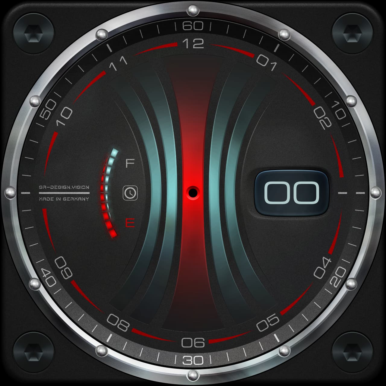
the dial now has the graphite surface.
the luminous elements have a slight sheen.
The outer ring now received special attention.
matted aluminum with chromed balls …
7 Likes
You want bigger Balls and a smaller Screw. Sorry :::)))
2 Likes
The number sets remind me of kitchen timer. Maybe you could
make the center motive to rotate
1 Like
do i need bigger balls or the face?
1 Like
actually a funny idea.
but that’s kind of not my thing.
1 Like
bigger balls 
little gimmick with the background
but that would get on my nerves at work
3 Likes
This is probably the final version.
5 Likes
Yay . Unique Javelin Hand is back . I know you dont use names for your tilles but Mandril comes to mind.
2 Likes
Hello…my opinion is that of someone who doesn’t know anything…lol…but I thought it was BEAUTIFUL…
2 Likes