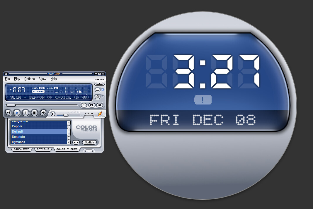
Only the oldschool kiddies will know what I am talking about! It really whips the llama! Or at least it has used to. Currently had no idea what to put on the bottom part of the watch, really!
12 Likes
Some sliders . Could tell all sorts.
2 Likes
Hey, that looks great, nice work ![]()
For the bottom maybe have a window like at the top, but have a live weather view in the window ![]() Just a thought…
Just a thought…
2 Likes
That looks really nice. You could add some fake buttons like the rewind, play, pause and stop buttons and maybe even come up with a unique watch brand and add it’s name in the bottom. One of my made up watch brand names is Amish-Fit.![]()
3 Likes
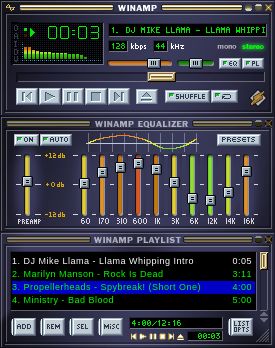
Winamp - that sure takes me back! Used to use that all the time. Nice one!
3 Likes
Mine is still kicking ![]()
6 Likes
While @icrltd4’s suggestion is a great idea, I feel like your suggestion kinda fits this watch more.
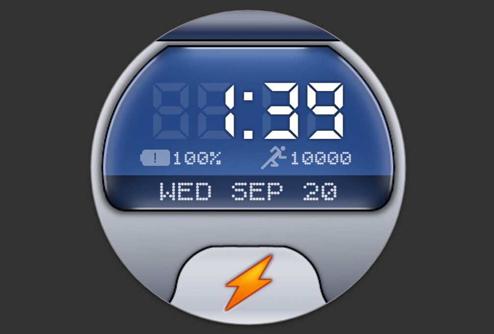
While I’m at it, I also added the titlebar thingy at the top for the manufacturer name, too, and also changed around some of the aspects (e.g. battery, steps, etc.)
7 Likes
Cool Idea!
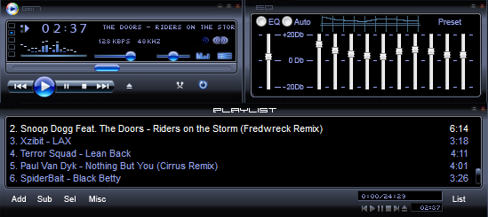
It would be interesting (and a bit complicated) to add equalizer at the bottom related to the heartbeat (#ZHR#).
3 Likes
Did you mean something like this?
Or more like this?
Or you could take just two bars rotated sideways for L/R channels.
11 Likes
Brilliant Peter ![]()
3 Likes
Yeay thanks Peter. Stunning work there . I hate the Fake do Nothing graphs tha folk show on thier faces to get syncs. Every Time you show us something it becomes a Bookmarked Topic . I wish you would make some Faces with all this Magic.
1 Like
You know, for me it is much easier to figure the basics for it to work, than do all the rest graphics to make it look fancy. I admire the guys who are good/fast at that, but I loose my patience if I cant see results coming fast. Cant plan/divide the graphic works into smaller portions well.
3 Likes
Muito legais…principalmente o colorido…fantástico
Very cool…especially the color…fantastic
2 Likes
Oh, that’s even better than before!
2 Likes
Very nice Peter, I think I like the sideways bars the best, but the others are also great.
3 Likes
It’s looking better with each change you make. Since you have a title bar now you could add the weather information scrolling across it like the long song titles used to do.
3 Likes
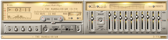
Ooooooh! I want to do something similar to that! I could implement that in it’s classic cousin like this one:
4 Likes
You are welcome, the examples are inspectable.
If you need to explain how to adjust something, just ask, or write me a message.
4 Likes
I uh… may need some help on this one. I tried adding the gradients, but it looked nothing like yours.
3 Likes
Note on that colored one I reversed the bars. They are actually the black semitransparent masks above the gradient image. You could place them so, that they start from top and grow downwards.
I like that mediaplayer style too ![]()
2 Likes