I uh… may need some help on this one. I tried adding the gradients, but it looked nothing like yours.
3 Likes
Note on that colored one I reversed the bars. They are actually the black semitransparent masks above the gradient image. You could place them so, that they start from top and grow downwards.
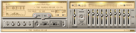
I like that mediaplayer style too ![]()
2 Likes
I see! I could try doing that.
Also, a fan of NFSU2, are you? ![]()
2 Likes
Haha you recognized my selection. Its just one nostalgic moment reminded me by another nostalgic moment. I do not play such intensive games for years. I have facer pro now (2 weeks remaining) ![]()
3 Likes
That’s a great topic.
I’m a fan of the dark classic view.
I’m curious how it ends.
2 Likes
YES!! Briliant! So cool and visually appealing.
2 Likes
You could put a step counter with a treadmill ![]()
1 Like
Amigo é possível usar esse estilo para a carga da bateria?
E, caso seja posso usar o modelo a cima?
Com a progressão das cores de verde a vermelho?
Friend is it possible to use this style for battery charge?
And if so, can I use the template above?
With the color progression from green to red?
1 Like
In the examples I made the bars to move according to the pulse, but mostly trough the whole range and in discrete increments of 1/10 of the range. If you want to just use the range same way for battery charge without pulsating, then the fill ratio would be like (floor(#BLN#/10)/10), or (ceil(#BLN#/10)/10), depending on whether you want the last bit disappear at 10% or at 0%.
2 Likes
Eu gostaria de que com o descarregar a bateria o ícone superior desaparecesse.
Seria possível fazer com que um lado marcasse a carga do celular e o outro lado a carga do telefone?
Perdoe se eu estiver sendo abusivo.
I would like the top icon to disappear when the battery is discharged.
Would it be possible to have one side mark the cell charge and the other side the phone charge? Forgive me if I’m being abusive.
1 Like
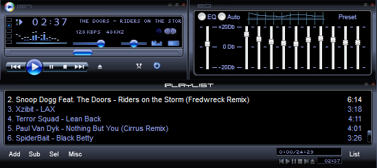
Nice, Is this a Winamp skin?
Can’t seem to find this skin anywhere. ![]() the “The Mandalorian” one
the “The Mandalorian” one
Mandalorian was the music in the playlist ![]()
![]() Oh, the nostalgia!
Oh, the nostalgia!
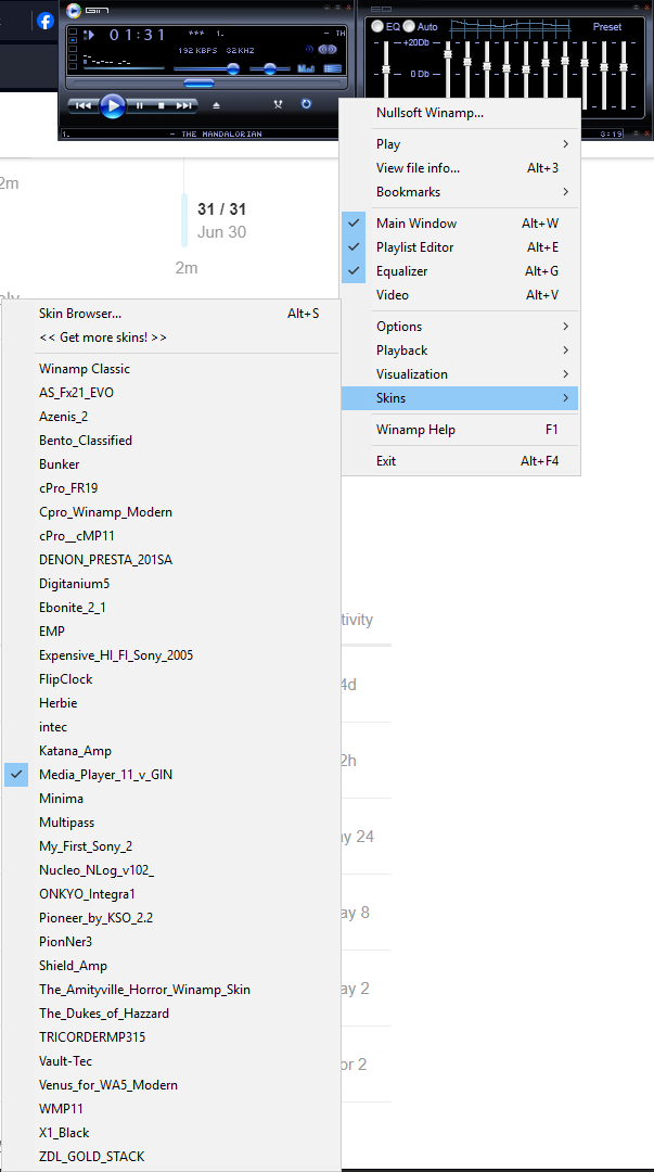
Do you know the name of that skin then?
Talking about this one
1 Like
I added link above
1 Like