Looking awesome so far. Love your light neutral metalish background. Care to share?
1 Like
v1.1, so to say.
Hands still quite ugly, but that’s not the point.
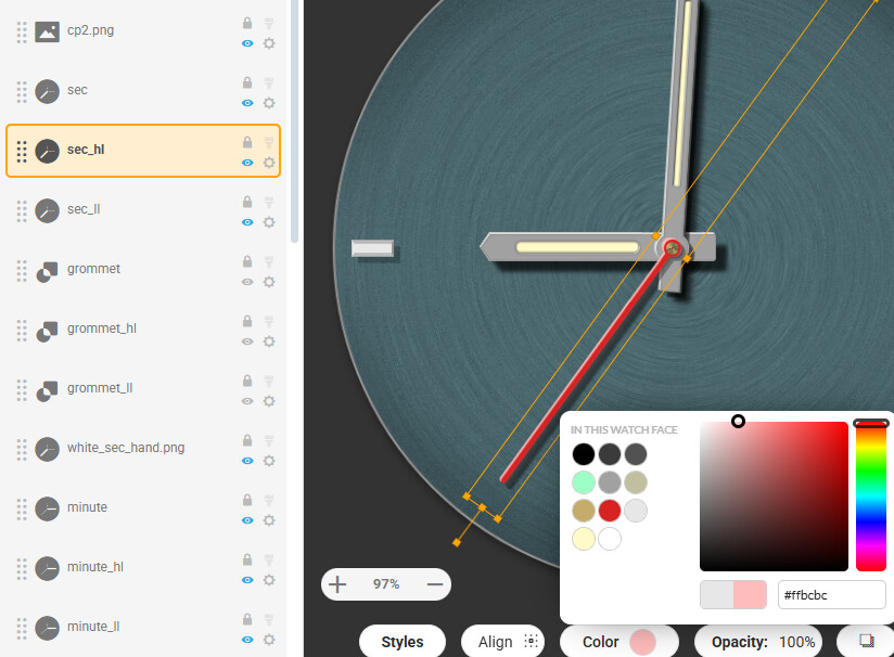
Now each hand has quite a few layers:
• hand. width: w. position: x/y. colour: whatever you choos
• highlight: width: w+2. position: x–0.5/y–0.5. colour: slightly off-white
• “lowlight”: width: w+2. position: x+0.5/y+0.5
• shadow on other hands (if applicable): like “lowlight”, width: w+2. position: x+2(or 3 or 4)/y+2(or 3 or 4). colour: (very) dark grey
• face shadow: rendered wirh Gaussian blur and +50% width. position: offset individual, depending on z-position, adjusted by feeling.
3 Likes
It’s great that you guys are letting out your secrets on how to make a good looking hand.
In my opinion it’s the hands that make or break a watch face - a panda watch is still a panda watch afterall. An extreme example of what i mean would be a Rolex face with facer hands - no matter how good the face was it’s the hands that makes it what it is.
3 Likes
Well, of course, but it’s just some sloppy start for something I don’t yet know what could become of it.
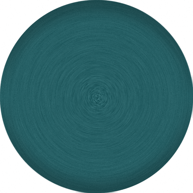
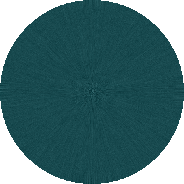
Just a plain circle with some noise on it, then radially blurred.I would LOVE to make it look metallic, but I can’t seen to get it right
3 Likes
I would consider making the highlights in general in lighter color shade of the main hand color instead just greyscale (that would come if added as overlay, but it is not in this case), unless its the part of needed exaggeration for the tiny watch display
4 Likes
Check some older posts
4 Likes
Looking good. Keep going.
3 Likes
It is fantastic, and thanks for the post
3 Likes
Like with a square bullet haha. Maybe I should round those “windows” a bit?
A lot of thanks for all your great ideas and links and hints! This is fun!!
4 Likes
I think you can exagerate the edge shadow more
and also maybe highlight the corners of the date “windows” which are not under shadow

5 Likes
Battery display idea. I love it (stole it from Jaeger LeCoultre lol), but something’s amiss … most oviously the difference between one and the same font used in Creator, and in Photoshop.
But how would YOU do this “battery wheel” in “real time” with circular text? I gotta try and wrap my head around it. The PS-created “battery wheel” is a weak excuse I think.
Maybe put it down above 6 o’clock, reverse the numbers. I still need a moon phase display …
3 Likes
This tutorial I put together maybe of interest…
5 Likes
Stunning stuff Tom! Thanks for sharing!
4 Likes
BTW if you double the opacity of a hand to 200 the Default Shadow it twice as dense . Quit handy for little sub dial hands .
Ah! That’s a nice detail! Thanks!
4 Likes
BTW . I like your Battery device . Make the low Numbers Red . Dump the Facer font for a custom one you enjoy . I have loads of font in a Folder that my Hands and dials ar kept in . So I use the same fonts in my CAD GFX and Creator .
3 Likes
WIll do! I always use a custom font (attached) - I just love condensed fonts. That’s the problem in my case, I installed it and Facer and Adobe interpret the kerning quite differently. WIll do as you said ![]()
This is my favourite:
3 Likes
Yeah not all fonts work perfectly on Facer . Filter them out . There are enough that do .
I will get that font tomorrow . Did you make it ?
2 Likes
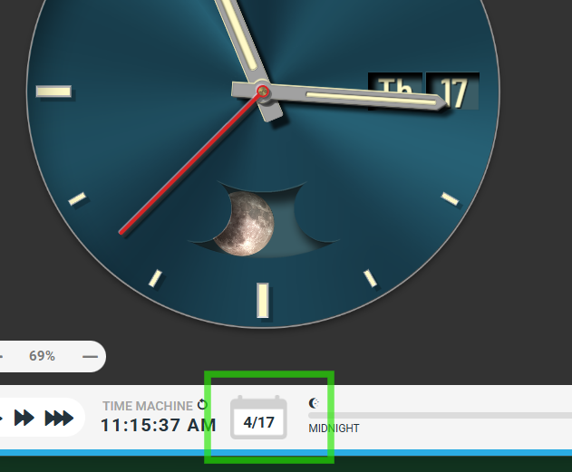
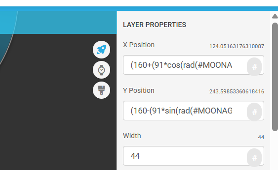
Aaaand with a moon phase complication. Shadow layer got mis-cut, unfortunately, will have to do some photoshopping later this day.
5 Likes
Nice moon Gadget . Don’t remember seeing that one before . I would dump the Shadow on the left over the moon image . Keep the shadow but get the moon image above it . Some reference for March 17th . You need to get your moon to rotate the other way unless this face is just for Australians .
I feel you will need to punch your Highlight device a bit . Looks fabulous on a Big screen preview . But on the Little screen it might be lost . As we use to say Filming . " They won’t see it from the one and nines " . 1/9d ( cheap seats at the cinema )
.

3 Likes
@mrscolumbo Excuse me I am sure you know hoe to make the moon go the other way but it might help others . I would not orbit the moon image but make a hand of it . Well done You .
.
3 Likes