I’m really not the systematic guy - naming conventions are a cool idea, gotta get used to it ![]()
tried one single highlight layer like you did on the “Simple Simon” - workd far better than anything else! Thanks again, mate. Will go from there now.
I’m really not the systematic guy - naming conventions are a cool idea, gotta get used to it ![]()
tried one single highlight layer like you did on the “Simple Simon” - workd far better than anything else! Thanks again, mate. Will go from there now.
I learned everything from guys here, and a need to play and make pretty. Just giving back.
Side note, All my faces are Simple Simon. It’s my moniker. Regardless of the swan feet underwater I want ‘at a glance’ readable faces. It is why I am finding it do hard to make a decent, semi realistic hybrid. Text too tiny.
I have a plan though. Slow simmer heid wise.
I bought my first smart watch (OnePlus 2) on Feb 14th. Because of the chance of wreaking creative havoc on my own watch face ![]() Never had smart watches on my personal radar, bacaue I simply never found any use for them that I couldn’t do with a mobile phone.
Never had smart watches on my personal radar, bacaue I simply never found any use for them that I couldn’t do with a mobile phone.
First thing was googling Facer.io, subscribing, and downloading a s**tload of “realistic” faces. All very excellent and beautiful, mind, but 99.9% (from my POV) just FLAT. There were a few that really did the 3D trick. I wanna get there, just for the heck of it ![]()
(but then again, I built my own analog synthesizer because I couldn’t buy what I REALLY wanted - and couldn’t afford even the slightest approximate model)
And you complain my maths is too hard?
Gonna stick with -1X/Y for now cheers but pretty as hell and good work. Nice face.
My problem too - 99% of the time mine always look flat!
I was in on day 2 of the Pebble Kickstarter. It made kickstarter and smartwatch history. It was only on 2M of its 100k pledge goal on day 2 and peaked ad 4.5M in a week. That’s when Apple went ‘OK, the time is now’.
The Pebble was B&W epaper display, 8 days battery to Apple’s 16 hours, but how times have progressed/
On my early faces I used cheap, but quite effective way to fake the shades and highlights, by making light and dark duplicates of elements below the actual layer, shifting them one or two point up respectively down. Once I even made them orbit like this:
A key to making something look realistic is to make sure the light and shadows come from the same place for all elements.
@GAUSS gave me some great advice back in the day - Remember that details get ‘lost’ on the small surface area of a watch. So, for things to look real, you actually need to exaggerate them slightly. Have a look at MikeOB’s shadows - they’re often very heavy and quite far from the hands, creating a sense of depth (wouldn’t look quite right up close, but looks amazing when it’s at the scale of a watch). Always make sure the lighting position and shadows are consistent. Similarly, most textures don’t even show up on a face, so designers like B# use quite heavy textures and exaggerated lighting/ shadows to make them pop. I’d also say that pure white and pure black don’t really exist in real life, so even for my darker designs, I’ll use very dark grey rather than pure black and light grey rather than white:
Yes . Guilloché has to be surprisinly bold to read at all . It olnly really workr in reality because it Glitters . That is hard work on a tiny display . I did not know what Anti Aliasing was till I started making these Faces .
So, layers on layers. Focus on one bit and make it the next bit is my current directyion.
I think I am getting there
I made some progress, too, but got tangled up in the shadow layer.
• hour hand has 1 shadow
• miute has 2 shadows. one narrow it casts on the hour hand, another broad one on the face
• second needs at least 2 shadows: one on minute and hour (ideally separately), a last one on the face
the closer shadows need to be sharper, because closer. the shadows firther away need to get softer, but mustn’t be separated, they must give the illusion of being one and the same.
Hahaha, Doctah! My brain hurts!
And my hands look pretty crappy ![]() Much to learn, I still have.
Much to learn, I still have.
The softer shadow is the better effect . People are not going to make a decision to sync on fine detail they are looking the overall effect . BTW if you double the opacity of a hand to 200 the Default Shadow it twice as dense . Quit handy for little sub dial hands .
Good tip
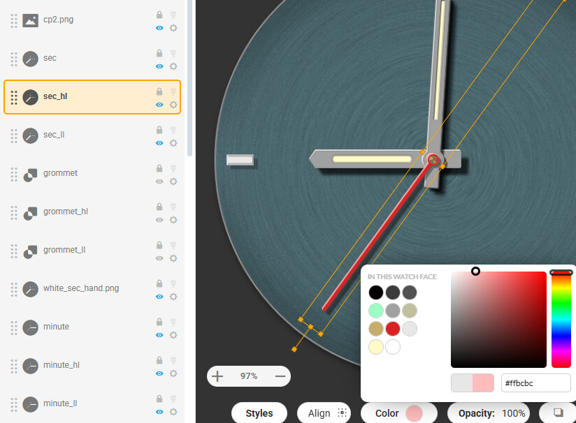
Looking awesome so far. Love your light neutral metalish background. Care to share?
v1.1, so to say.
Hands still quite ugly, but that’s not the point.
Now each hand has quite a few layers:
• hand. width: w. position: x/y. colour: whatever you choos
• highlight: width: w+2. position: x–0.5/y–0.5. colour: slightly off-white
• “lowlight”: width: w+2. position: x+0.5/y+0.5
• shadow on other hands (if applicable): like “lowlight”, width: w+2. position: x+2(or 3 or 4)/y+2(or 3 or 4). colour: (very) dark grey
• face shadow: rendered wirh Gaussian blur and +50% width. position: offset individual, depending on z-position, adjusted by feeling.
It’s great that you guys are letting out your secrets on how to make a good looking hand.
In my opinion it’s the hands that make or break a watch face - a panda watch is still a panda watch afterall. An extreme example of what i mean would be a Rolex face with facer hands - no matter how good the face was it’s the hands that makes it what it is.
Well, of course, but it’s just some sloppy start for something I don’t yet know what could become of it.
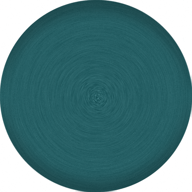
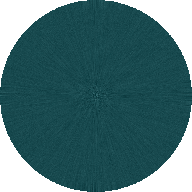
Just a plain circle with some noise on it, then radially blurred.I would LOVE to make it look metallic, but I can’t seen to get it right
I would consider making the highlights in general in lighter color shade of the main hand color instead just greyscale (that would come if added as overlay, but it is not in this case), unless its the part of needed exaggeration for the tiny watch display
Check some older posts