Indeed but only one in the line ever dancing at a time if false is just :$
1 Like
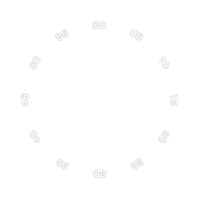
7days disk:
Interesting topic here, especially the weather font…:
3 Likes
Forgot I had a whole topic on it. Will have to go back and re-read the other responses in case I’ve missed better solutions.
2 Likes
Hmmmm. Seems I need a formula to adjust text rotation to the position of the character. Trigonometry with bells on. Well, there’s still time before the universe ends.
1 Like
Not sure what you mean there. The rotation offset should be equivalent to the X/Y.
So -90 in the sin/cos expressions is no offset for rotation. -98 in X/Y is -8 in rotation.
2 Likes
Thx for the reply! Yeah, just got it - rotation and position on the “arc” are relative to each other. ![]() REALLY need a fixed width font here. Took this “Source Code Pro” for testing, but will need one that’s more pleasing to the eye. I like the font you posted. Gotta try. But now it’s bread work time
REALLY need a fixed width font here. Took this “Source Code Pro” for testing, but will need one that’s more pleasing to the eye. I like the font you posted. Gotta try. But now it’s bread work time ![]()
Gotta say, I’m completely awed by both the pracitcally selfless support here (I’m a musician, and I know Steinberg forums, they just burn you from the first question on) AND the totally bonkers ingenuity of you people. What a ride this is ![]()
1 Like
Yes, but once you did it, you can change size, font, effect etc. for all at once.
I will try to share that “template file” when I get to my old PC.
2 Likes
Cheers. I guess it is a learning curve thing as well. Once I see something the noggin will make room for it, and expansion, having seen it in action.
1 Like
I made me template like this. It is not perfect, as the Powerpoint is not perfect. It tends to export the images in uneven sizes, the actual size is hard to predict at rotated elements. But to make a change, simply ctrl+a on a slide to select all, then change font or effect or font size (if you change size of elements, you will have to align them to center quick), right click while all are selected and pick save as image and something like this can pop out

3 Likes
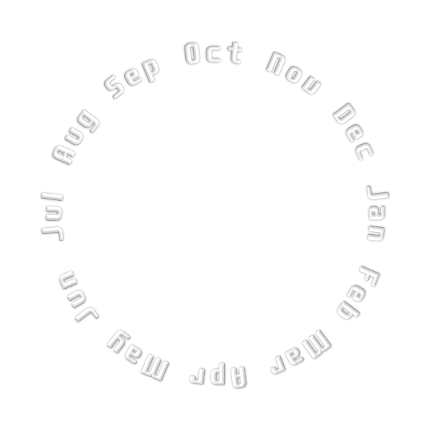
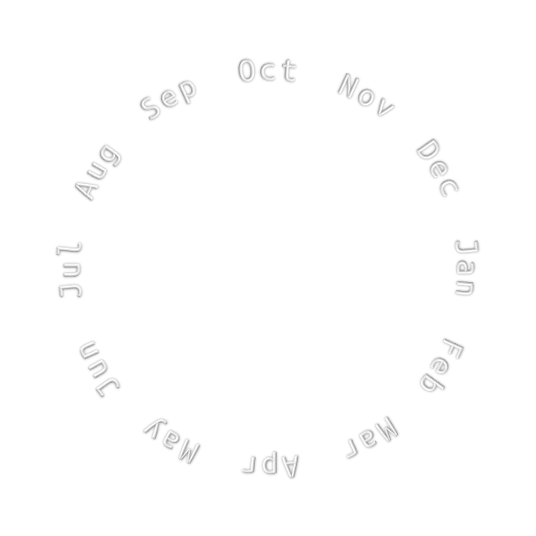
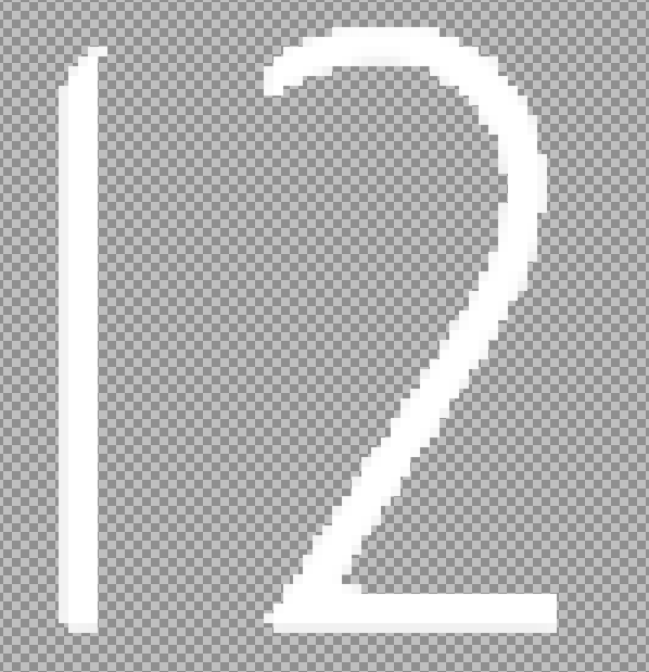
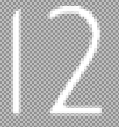
Yeah, I do like those! Even installed PowerPoint now for probably the first time in my life ![]() Problem with this particular project is, that I’d need MON DAY 12 in a row, where “12” are text, but MON and DAY are from such date wheels. And I need to blot out unused months with an arc sector, but I can’t do this with the second wheel at the same time because of those “blot-out layers”. If you know what I mean, my English is quite rusty.
Problem with this particular project is, that I’d need MON DAY 12 in a row, where “12” are text, but MON and DAY are from such date wheels. And I need to blot out unused months with an arc sector, but I can’t do this with the second wheel at the same time because of those “blot-out layers”. If you know what I mean, my English is quite rusty. ![]()
So I reverted to text in this case. But I will do a face with concentric wheels soon - I love the feeling, and somehow they have a soothing effect on my stressed soul ![]()
[Edit] It actually WOULD work if the space between the separate month and day name strings would be large enough, so I can put MON and DAY in a row and blend out the rest with an arc cover. Gotta try this, but I’d need to use smaller fonts.
Still the problems remain with the really ugly rendering that Photoshop does to a perfectly good text path. Just getting “cloudy” PNGs in the end regardless of the rasterizing settings. THANKS for the PP template - this is a great help!
2 Likes
You found solution before I could write it down ![]()
That with the PP was just cheap tip, many people have it preinstalled within MS office bundle.
Did you try to export the text from gimp? Its open source powerful image editor, it can open .psd files (maybe not handles all newest PS features, but it should suffice for the export alone).
2 Likes
Hm, I know Gimp, could try it with this, you’re right. But I really think I just missed some essential settings in Photoshop - I just haven’t found it yet. It’s a HUGE piece of software. But maybe Gimp does a better job right out of the box. Will try it!
1 Like
Heh, I shouldn’t type BEFORE I think
1 Like
Awesome Sauce. On a stick. With sprinkles. And an ‘Adopt a Unicorn’ certificate.
1 Like
Strange. I don’t have a huge issue in paint.net as long as I am careful with things like tolerance, and the 2 antialias modes. I think the thing there is that because it is a simpler program a lot of the needed options are more obvious and, of course, I am now used to it.
I find the things to pay attention to most are the tolerance and in order:
Tolerance alpha mode, Rendering [anti]alias, Selection [anti]alias
I fins as well, that if you work on a larger image (such as the exported 960x) and then shrink to 640 at the end it does a fair cleanup job. I assume PS would do something similar
1 Like
I have tried Gimp on a number of occasions and realise how powerful it is. The UI has become a lot better over the last 20 years but as I don’t use it much I still find the UI a little overwhelming so stick to what I know. My tips and screenshots will always be from P.N but I am sure the terms are transferable to what people are used to. Maybe Gimp will be more familiar to PS users.
1 Like
Okay, I did a test face with all the PNG rendering options available in my Photoshop version (newest, I think). You can switch through the differently rendered layers in facer creator.
Just to demonstrate that it all looks rather crap.
Here’s the psd-file:
1 Like
So, the issue here may be that we are starting from a .psd file that might not be the best.
I may be wrong but…
Just updating Gimp as paint.net does not seem to support psd to open.
1 Like
Sorry, I dont know what would you actually expect. The font is thin, the radius to font size is big, so the verticals are just slightly sloped and I really doubt the visibly feathered eges will ever look better.
Actually I can not see any difference in results between the various methods.
I think Gimp will make it look same way or even worse.

1 Like
Also I know why I don’t like Gimp.
Save as. Where is PNG or other than some xsf style format, and horrible floaty nonsense I don’t need. It’s why I never went to Photoshop when I could get it free and stuck with Painshop Pro and then paint.net
Simpler=easier. Pretty certain that is where you are going, so if PS can curve for you then great but larger (960 should do it) image export to PNG and touch up in a simpler program, maybe cutting back to pixel aliased and not anitaliased edges (cut the smoothing on the larger image), Resize to 640 for final edge clean smoothing.
960x, stripped bare
After resize to 640
1 Like