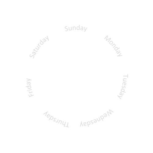
A white text “day of the week” circle.
Download 640x640px PNG file below:
The expression to show the current day at the top of the circle is:
Rotation: (-(#DOW#/7)*360)
Below is a template for the day text display window:
A white text “day of the week” circle.
Download 640x640px PNG file below:
The expression to show the current day at the top of the circle is:
Rotation: (-(#DOW#/7)*360)
Below is a template for the day text display window:
Nice!
Nice & Helpful.
It should also be avail in the tuts section.
You are most welcome. I look forward to seeing how you use it 
That’s it so far, thank you very much 
It’s a ways from being finished but the general idea is to make it easy to view for people that use readers (like myself).
Next step is to learn how to show only the current day (hide the other 6 days). And I’m hunting for a tutorial about how to make my own day circles because that’s a great way to make a watch face look better.
Thanks for the inspiration!
In this case to onlyshow one weekday you will need a graphics program like photoshop or gimp to cut off the windows and set the weekday wheel behind.
Such Day cyles can be done with the same software. Some use as well illustrator or powerpoint
Make a copy of your face background with the tickmarks and all, then cut a hole where the current day is and put that image on a layer above the circle with all of the days.
Thanks this sounds easy enough. Learning… slowly learning.
Looking good, a nice start!
Great advice from the guys above. It is great that you are setting out how to learn how to edit your own images.
I don’t know how you would do it in other applications but if they are similiar to Photoshop, the way I would cut out the window in the layer that goes above the other days is:
Now that you have your cover layer, the order of layes would be is:
bottom: background layer ( needed because it may be possible to see throught the edges of the overlapping feathered edges between the day window and your new layer ). You can just rely on the background colour for this if you want but only if the colour matches your face. Otherwise, you will need to put a new layer here ( you could simply duplicate the top layer and use that ).
2nd layer: day window
3rd layer: day circle
top layer: your new layer
If the cut-out in your layer turns out to be too small/large then just repeat as above but expand/shrink the final selection before you cut out the window in your layer.
I hope that helps.
Cheers
Mike
Thanks Mike, I appreciate the help!
I’ve decided to try to learn the basics of Illustrator. Photoshop I know how to use to edit photos but doing graphics work is not in my wheelhouse… yet 
I’ve made some small changes to the design, which can be seen above.
Thanks again everyone
Being a total noob to all of this, I’m now on a cool learning curve thanks guys, and big thanks to Mrantisocialguy ,for pointing me in the right directions, much appreciated 
Perfect! I will use one of these ![]()

![]()
You need to make a graphic that has a cutout at the top that is wide enough to show the longest day (Wednesday) and put the text under it.
Then the whole bubble lens part needs to be part of that image with the cutout.
Here’s a Test example I made some time ago, Inspection is Open so you can look -
I used a Solid Circle, cut the Days out of it so they appear as holes in the circle, then a simple block was used underneath to show through the correct hole at the correct time. Hope that all helps ![]() (I like to use White as a base colour, purely because it is quick and easy to colour in the Creator).
(I like to use White as a base colour, purely because it is quick and easy to colour in the Creator).


I only now noticed that you use the #DWR# tag for the rotation. it is not documented, I did not even know it existed!
Anyway, it is the same as : (#DOW#*51.429) given Sunday is at the top. (360 degrees/7 = 51.429)
If you use a pointer or a hand, same thing. If you want to also show how old the day is, you could move the pointer of that day 24h within the 51.429 degrees.
The rotation formula for that is:
(-25.714+(#DOW#*51.714)+(#DWFHS#/7))
The negative value -25.714 is to start at the beginning of the day, so at the left end of the sector.