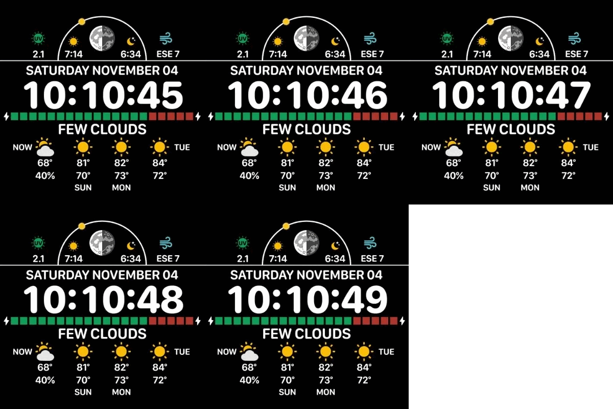
It’s always a battle… ![]()
I like putting as much data as possible and I also like big readable fonts.
Plus some graphics.
Not an easy task for the small screen of the watch.
But I never use fonts smaller than 16.
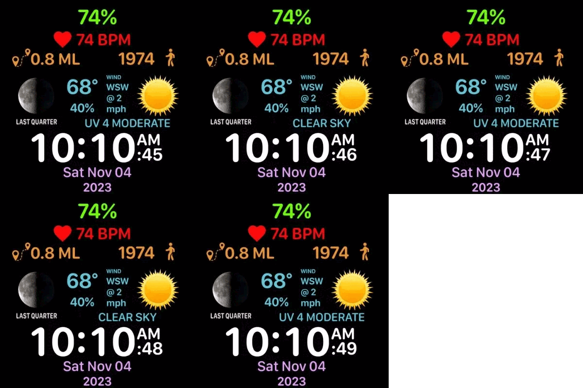
It’s always a battle… ![]()
I like putting as much data as possible and I also like big readable fonts.
Plus some graphics.
Not an easy task for the small screen of the watch.
But I never use fonts smaller than 16.
Ha Ha . I am at 22 px . I like to be able to read stuff without my glasses . I still have to get it quite close to my Face but I can just read it . It is very Important to me to know the Wind Speed and Direction in the middle of the night when I get up for the Loo .
Have you thought about a Gravity Fed Data Back ?
Oh I see . You have some altenative stuff on AOD .
![]()
![]()
![]()
![]()
![]()
![]()
![]()
Knowing the UV index in that situation is also essential.
I like the steps,wind and distance icons you’re using. As far as the weather icons go I’m going to use outline icons because for example the cloud white fill is unnecessarily distracting and takes focus away from the rest! Imho
This is one that I have in the works, but won’t publish until December some time.

…and the rain icon! Love the umbrella ![]() you have inspired me to make a weather watch! The Health and Weather watch above will definitely get a sinc from me.
you have inspired me to make a weather watch! The Health and Weather watch above will definitely get a sinc from me.
Interesting one! Nice work.
This is still work in progress…
(check the battery indicator at bottom upon wake…
I like the Self Test on your Quintenary Counter. You spent more time on that to the rest of the Face . Good Font .
‘Quintenary’ - that’s a new word for me - had to look it up. Something new every day here!
Don’t feel bad, I had to look it up also. And I know a lot of $10 words, but never run across that one before.
Thank you @masterboyhr . Here’s one that is finished and I will be publishing it in about 12 days.
MAG 2574

Sorry Guys I had to look it up as well . I made something on a MICROBIT for Tooth Brushing . It has a 5 x 5 LED Matrix as it’s display . So I went for Quintenary on that . Just for Fun , 3 columns gave me 125 seconds That is long enough .
MAG . How do yo prepare these previews you are showing us ?
Well, I created the font myself, which was quite some work too. ![]()
I kind of wondered it looks special and I have not seen it any where . Jolly well done I say .
I am pulling a @icrltd4 to do it. I right click the watchface in the main page of Facer Creator and select “Save image as”. It saves as a .webp file which I upload to EZGIF Editor and save as a gif. Then I just upload it here like any other picture. I think if @Facer_Official is going to keep using .webp images in creator the least they can do is to allow them to be posted here as images to make things easier.
Wow . Thanks for that :::)))
Please publish your work with UV here, I’d like to see what you have done with it.
Here’s one I put together. UV index graph (3rd graph from top) progressively goes from green to red as it gets closer to 12.
Cool!
I enhanced my older face with the scala above.
It is a bit tiny, and I do not always get the weather readings, so sorry, dont know if it works well even on watch.